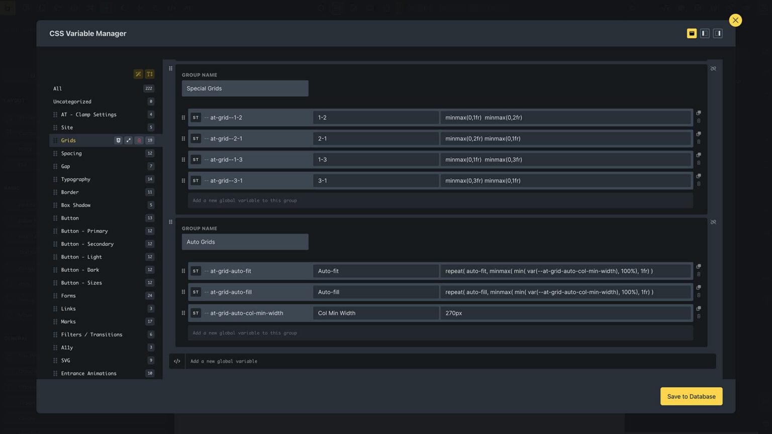
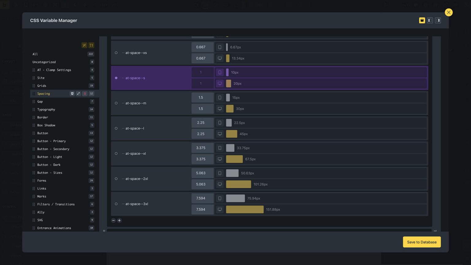
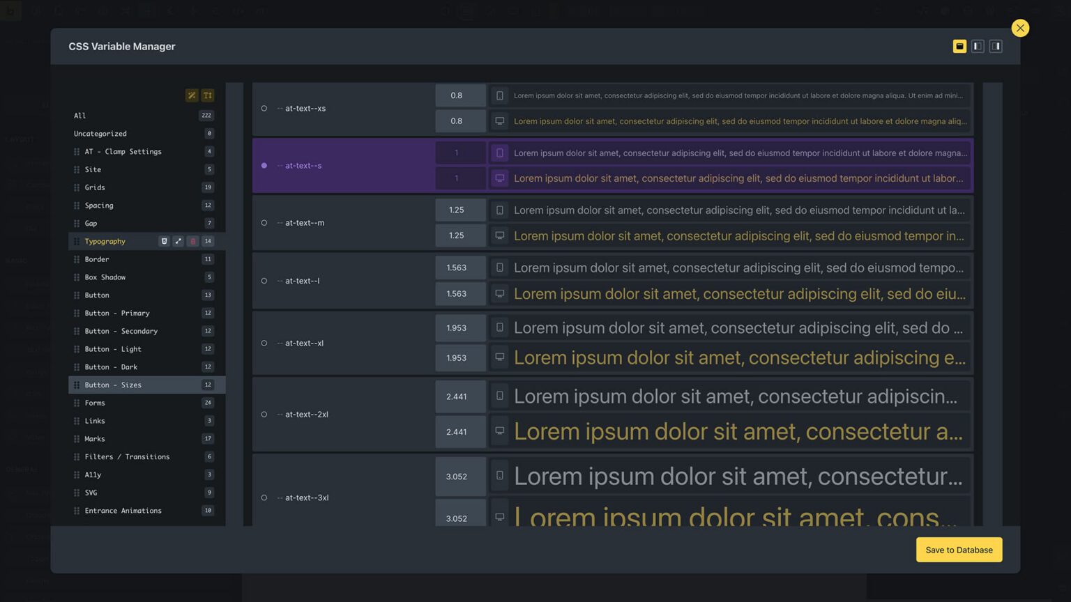
Responsiveness
Layouts and text that adapt to any screen size
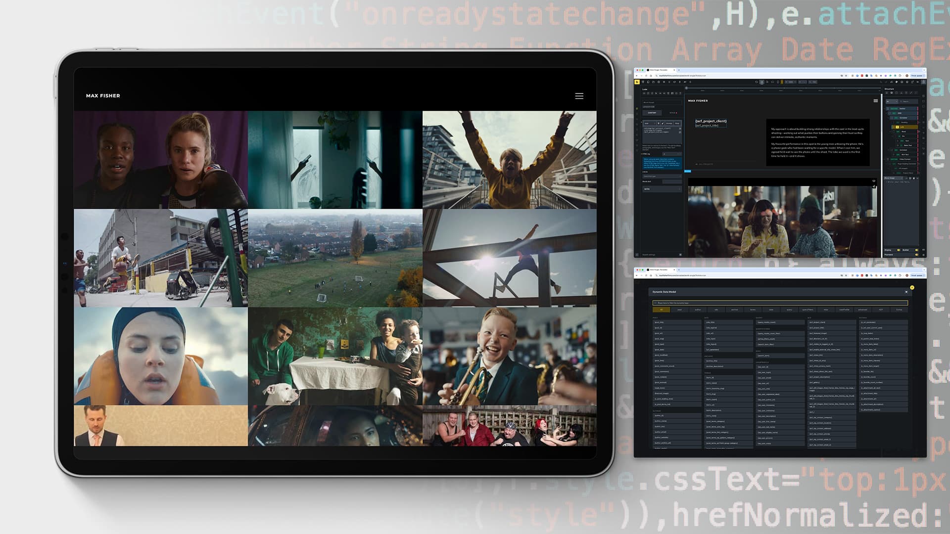
I build websites that are fast, efficient, and easy to manage. The layouts are responsive by default, with typography and spacing that adjust smoothly across devices and all screen sizes. I keep development lean and structured to reduce repetition, making updates simpler and less error-prone. Performance is built in with optimised images, measured use of scripts, and caching to keep pages quick. Accessibility standards are followed so sites remain clear and inclusive. For some projects, I’ll recommend a static HTML or flat-file CMS for speed, security, and portability. For others, a full CMS like WordPress provides flexibility for regular updates. My approach is to choose the right tool for the job, not to force one method. The result is a solid website that works without problems.
I build websites with efficiency and maintainability in mind. Structures, spacing, and typography are set up in centralised systems, so changes apply consistently across the site. This avoids duplication, keeps code lean, and ensures projects scale smoothly without unnecessary rework.