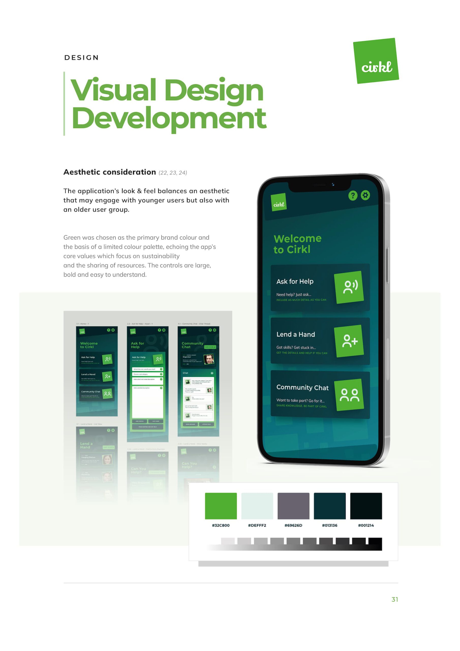
People often need help with day-to-day tasks, but issues with trust, confidence, motivation, and a lack of social connections sometimes undermine their participation in the community, eroding opportunities to ask for help. The goal was to create an engaging mobile-first system that facilitates service exchange and fosters shared community knowledge.
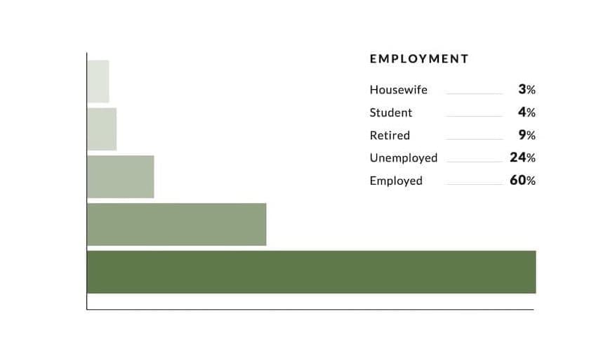
The project is based on research from a previously published time bank study involving 255 participants. This dataset informed my design process, helped me to avoid assumptions, and treated motivation as a key design input. The research revealed that while economic factors played a role, they were not the sole motivators. Altruism, learning and community involvement emerged as strong drivers. This insight led to a product structure that moved away from a “request and fulfil” loop towards three distinct engagement modes: asking for help, offering help, and participating socially without any requirement to participate in transactions.
I translated these findings into an interaction model, information architecture, wireframes and an evaluation plan. Heuristic assessment and a cognitive walkthrough identified specific usability gaps, guiding focused improvements for the next iteration.
This project built on existing time banking research rather than conducting original fieldwork. The goal was to explore platform potential and to create a research-led first iteration suitable for early design and evaluation.
The objective wasn’t to simply create an application to facilitate time banking. Time banks already exist but are underused. My goal was to design an interaction model around reducing motivational complexity, starting with verified behavioural evidence rather than feature brainstorming.



The project addressed issues caused by rising living costs and weakened community cohesion, promoting time-banking's potential to support people struggling to get by. The focus was not primarily on facilitating service exchange, but on effecting behavioural change, removing the barriers that prevent participation, so involvement feels safe, visible, and worth returning to.
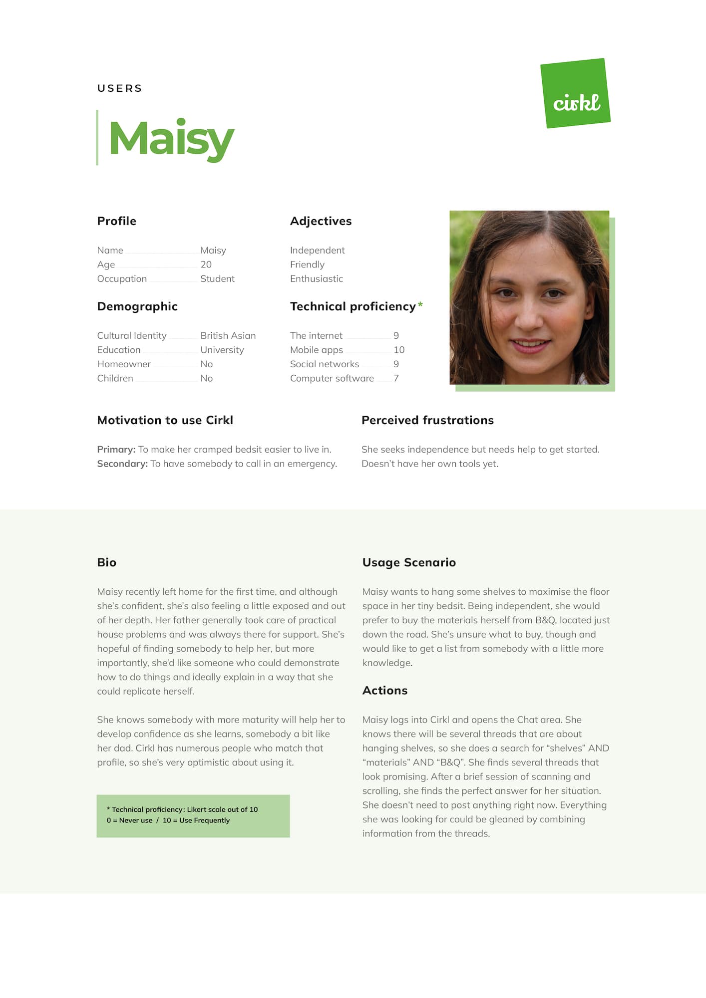
Research showed a wide mix of ages, confidence levels, and motivations. Cirkl was designed to support this range, from people seeking help to those wanting to contribute or connect. Four detailed personas were developed to reflect these differences and test whether the system could support varied needs without overly favouring one type of participant.
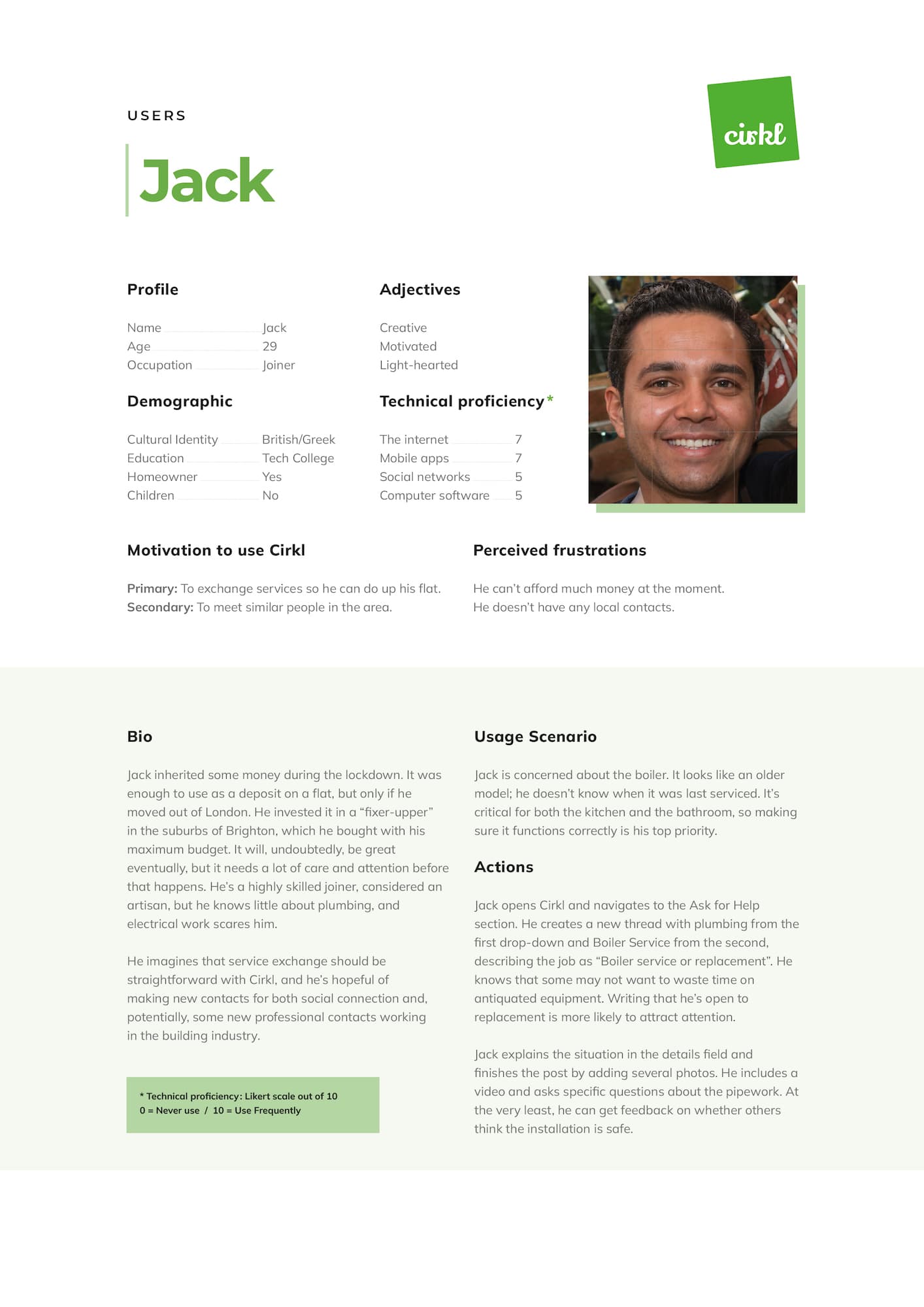
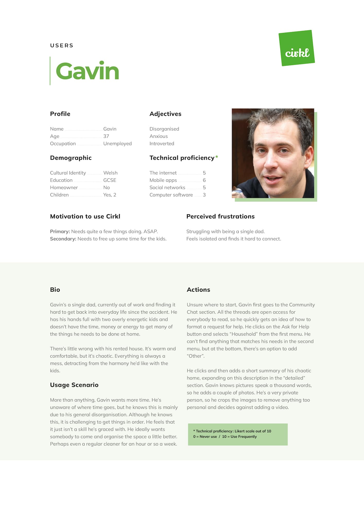
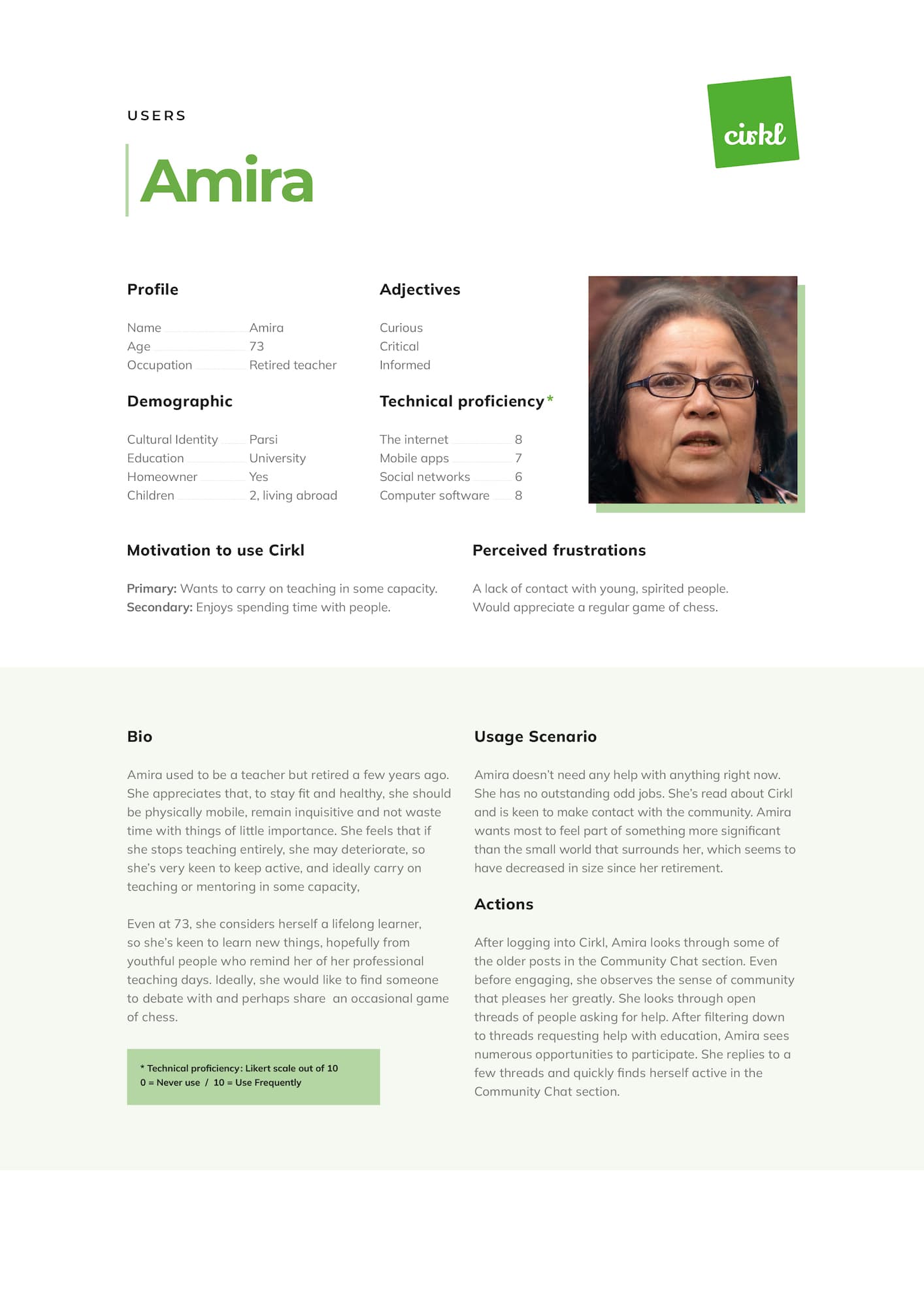

To cross-analyse user data, motivation, and to guide project structure, I employed a sequence of interconnected methods. This combination aimed to synthesise meaningful insights for appropriate app function.
This approach prevents a common failure in novel projects. Instead of jumping from insights to screens, I built a bridge from behavioural evidence to task structure. Then I used evaluation methods to test if the structure can be learned and executed.
Using multiple methods in parallel revealed insights that wouldn’t have emerged in isolation. Personas exposed unmet needs, motivation data challenged my assumptions, and task and concept models revealed structural and procedural gaps. Together, they created a clear line from research findings to roles, flows, and interface decisions, allowing design choices and usability issues to be closely tracked and mirrored to the evidence.
Synthesis focused on turning the research findings into concrete design structure. Motivations were grouped into themes, which led to three distinct engagement roles and the separation of membership from the need to engage in mutual exchange. This clarified how people participate in different ways and shaped the decision to support non-transactional involvement alongside active requests and offers of service.
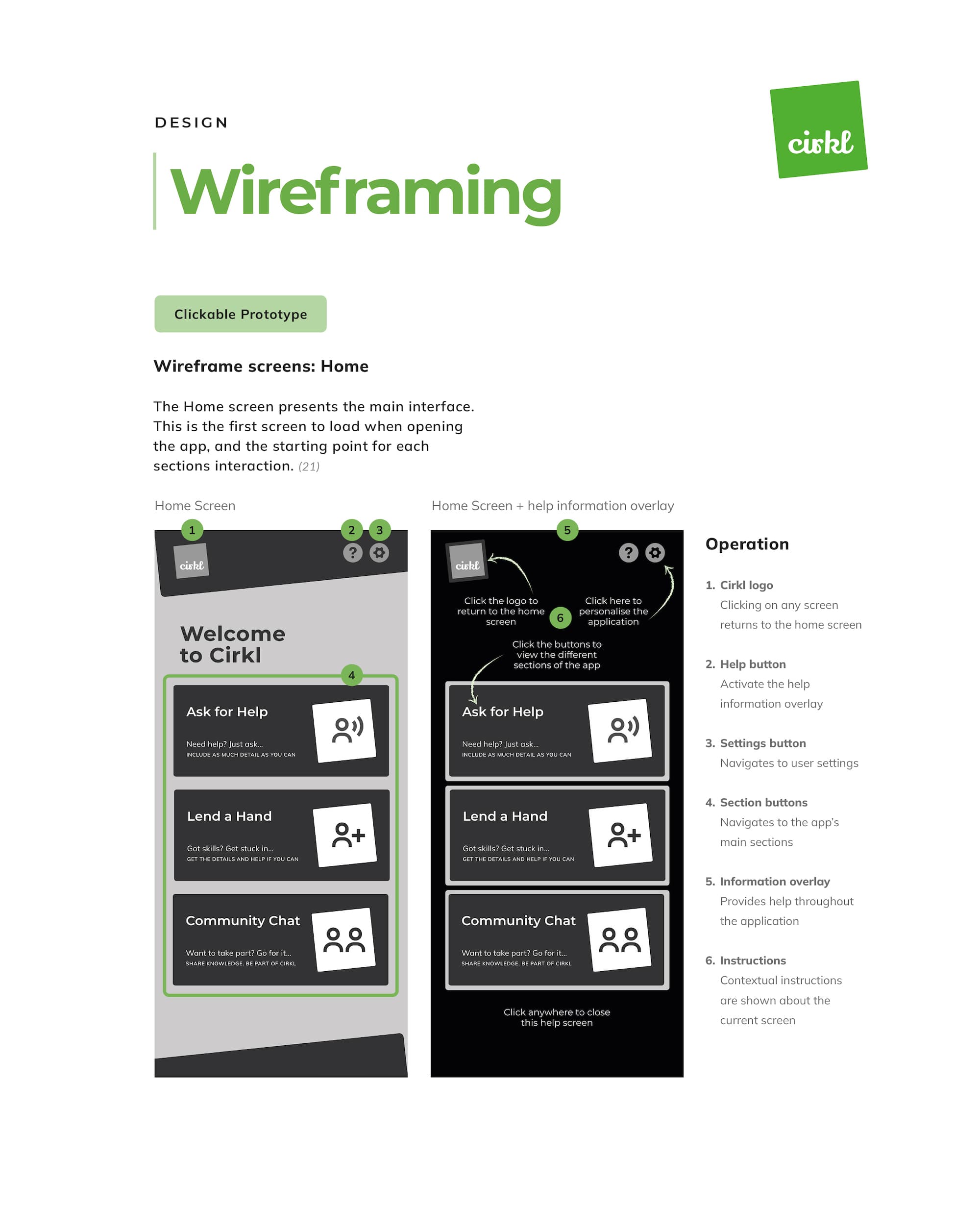
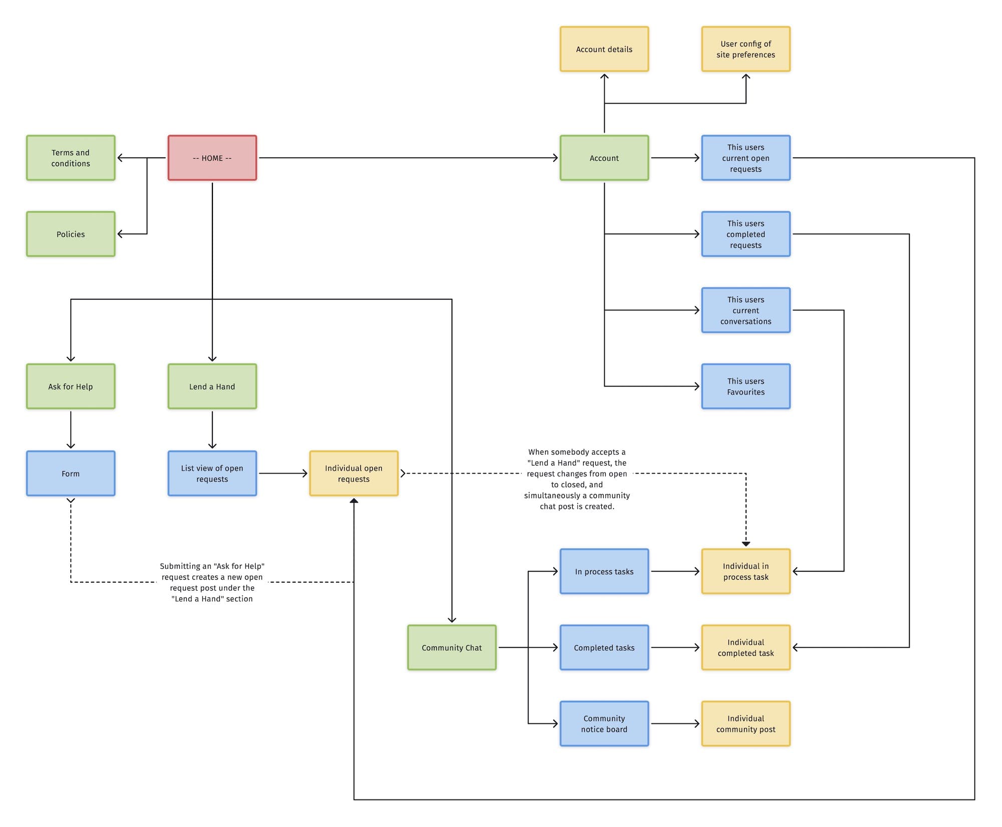
Cirkl’s interaction model and product logic are organised around three main sections with clear rules for creating and managing posts and threads.
This logic aims to transform every interaction into shared community knowledge. By keeping threads accessible after completion, learning is supported, duplicate requests are reduced, and new users can observe and understand community norms through previous interactions.

The information architecture focused on clarity and separation of activity. A single home hub linked to distinct request and response areas, with clear differentiation between open, in-progress, and completed tasks. This structure kept the product centred on activity rather than messaging, ensuring communication only existed to support service exchange rather than becoming an end in itself.
Usability was defined using ISO criteria and shaped by practical constraints around privacy, location, and platform. The app was designed as a mobile-first progressive web app using a nickname-based identity model. Location was captured through partial postcode entry, balancing usefulness with privacy and influencing several interface and interaction decisions.


I created a prototype and assessed it using two complementary approaches: a heuristic evaluation against the ISO HCI dialogue principles and a cognitive walkthrough to assess its learnability for novices.
The heuristic assessment provided a broad quality overview encompassing consistency, controllability and suitability for learning. The walkthrough then pinpointed potential user stalls, particularly for older users who depend on explicit feedback and guidance. Together, these methods generated actionable iteration targets.
The Cirkl documentation is a 44 page report that demonstrates, in detail, how to design a system around behavioural evidence rather than starting with surface features. The project demonstrates how motivation data can inform role modelling and pathway design and how evaluation can identify specific friction points even in early wireframe stages. Furthermore, it illustrates a pragmatic approach to iteration, prioritising improvements based on observed breakdowns over personal preference.
Methods included — Personae, task and flow modelling, IA, UML, conceptual models, wireframes, prototype, heuristic assessment.